
Table of Contents
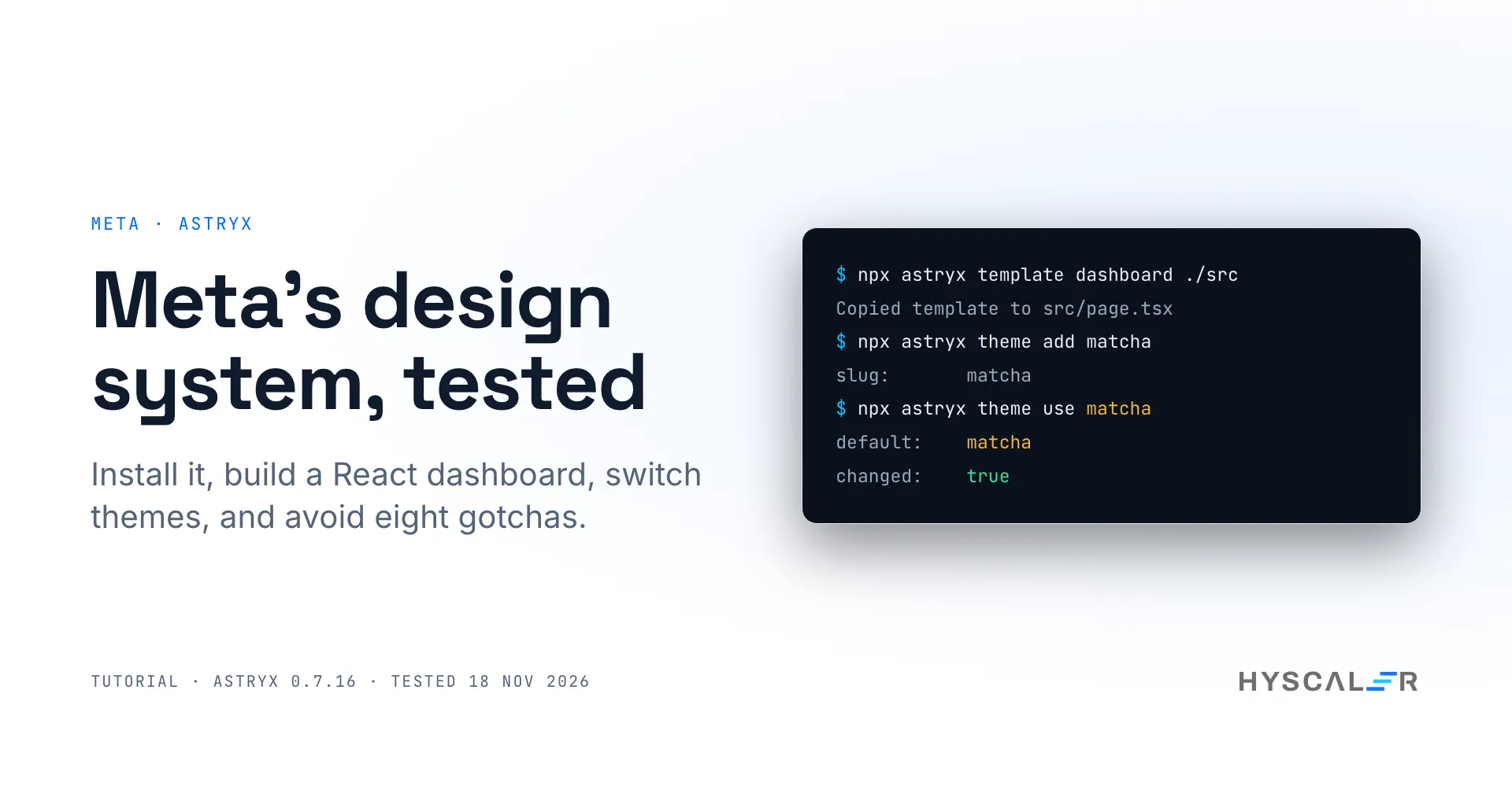
Astryx is an open-source React design system from Meta that ships accessible components, ready-made themes, page templates, and a command line tool that both developers and AI coding agents use to build with it.
This Astryx design system tutorial takes you from an empty folder to four themed pages. It covers the install, the theme setup, four pages scaffolded from templates (a dashboard, an AI chat, a checkout form, and a login page), three themes, and dark mode. Every command and output below comes from our own test of version 0.7.16 (repo commit 484f7af) on 18 November 2026, first in a Docker container and then on a Mac. We also make a custom brand theme, eject a component, and list eight gotchas we hit, including one where the README is ahead of the release.
Key points
- Astryx is Meta’s React design system, MIT licensed and in public beta. Version 0.7.16 lists 174 components, 58 page templates, and seven themes.
- Setup took five commands and about one minute of installs in our test. It needs React 19 or later, and no build plugin for the default path.
- Themes are packages.
npx astryx theme use matchachanged the fonts, corners, and colors of a running app in under a second. - Its CLI is also the manual: component docs, templates, and a guide for coding agents all come from the same tool.
- It is not for you yet if you need a stable API. It shipped six releases in eight days this month, and ejecting a component pulls in a StyleX compiler.
What is Astryx?
Astryx is a design system that grew inside Meta and was opened to the public as a beta in June 2026. Its README says it powers more than 13,000 apps inside the company. The public packages give you the same thing in four parts:
@astryxdesign/core: the components, theme system, and utilities. The README says “150+” components;npx astryx component --liston 0.7.16 printed 174.@astryxdesign/theme-*: seven ready-made themes (Neutral, Butter, Chocolate, Matcha, Stone, Gothic, and Y2K).@astryxdesign/cli: component docs, templates, theme commands, and upgrade codemods.@astryxdesign/build: build plugins, needed only if you compile it from source.
It is built on React 19 and StyleX, Meta’s styling library, and released under the MIT license. The docs site has a Storybook and a sandbox.
On 18 November 2026, the repo had 30,044 stars and was third on GitHub’s weekly trending list, with 10,939 stars gained that week. It also moves fast: six releases between 7 and 14 November, from 0.7.11 to 0.7.16.
Why it matters for teams building with coding agents
Most design systems are written for people who read docs. It is written so that a tool can read it too. The component docs, the templates, and the rules (“start every page from a template”, “no raw <div>“) sit behind one CLI, and astryx init writes a short guide to that CLI into your agent’s instruction file.
My view: a coding agent writes better UI when the rules live in something it can query, not in a wiki page it never opens. That does not remove review. It gives the reviewer fewer one-off layouts to read, because the agent starts from the same templates a person would.
If your team is still choosing between building its own system and adopting one, our guide to design systems with React and Tailwind covers the build-it-yourself route. For reviewing what agents produce, see our guides on reviewing Claude Code plans with Plannotator and testing an app with agent-browser.
How it works
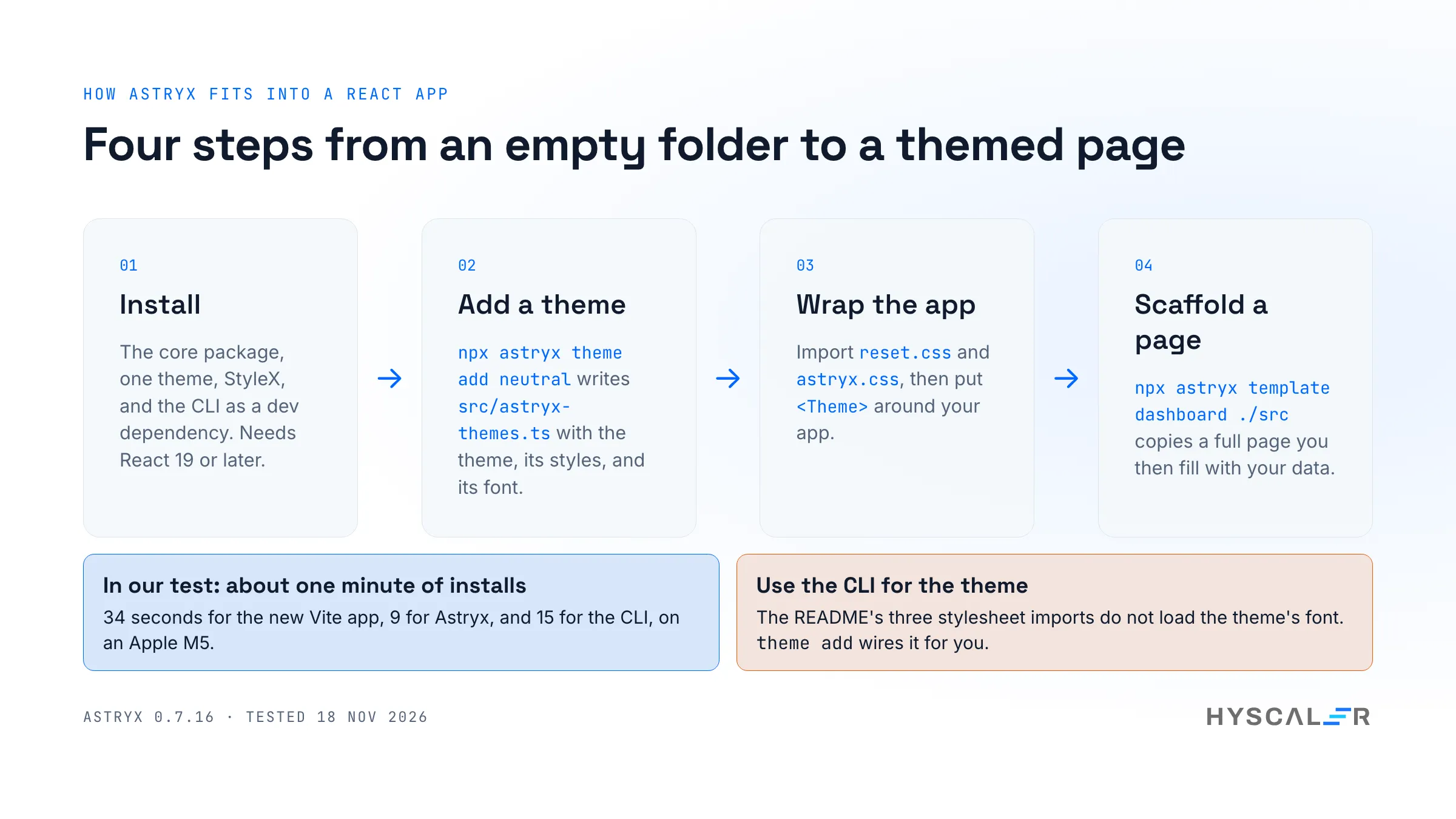
There are three moving parts in an app that uses Astryx:
- Prebuilt styles. Two stylesheets from the core package,
reset.cssandastryx.css, hold the styles for every component. They are compiled ahead of time, so your bundler needs no plugin. - A theme. A theme is a package with a built module, a stylesheet of token overrides, and a font stylesheet. You wrap your app in
<Theme theme={...}>, and components read their colors, radii, spacing, and fonts from CSS custom properties. - The CLI.
npx astryxprints component docs, lists and scaffolds templates, adds and switches themes, and checks your setup. It writes plain files into your project.
The styles are layered with CSS @layer: reset first, then component styles, then theme overrides. That order is why a theme can restyle every component without touching component code.
How to set up the Astryx design system step by step
1. Check the prerequisites
You need Node.js 22.13 or later for the CLI, and React 19 or later in your app. We used Node.js 24 and a new Vite app, which installed React 19.3.
2. Create the app and install Astryx
npm create vite@latest astryx-demo -- --template react-ts
cd astryx-demo
npm install
npm install @astryxdesign/core @astryxdesign/theme-neutral @stylexjs/stylex
npm install -D @astryxdesign/cli
We ran the installs twice, once in a Docker container and once on a Mac. The times:
| Step | Mac, npm 11.6 | Docker, npm 11.19 |
|---|---|---|
| Create the Vite app | 2 s | 1 s |
npm install for the new app | 34 s | 28 s |
| Astryx core, a theme, and StyleX | 9 s | 12 s |
| The CLI | 15 s | 19 s |
| Recharts and Heroicons (step 5) | 6 s | 13 s |
So the whole setup is about one minute of waiting on either machine. On disk, the core package is about 44 MB and the CLI about 29 MB.
One warning from the README that is easy to miss: before the CLI is installed, always use the scoped name, npx @astryxdesign/cli. The short name astryx belongs to an unrelated package on npm until the CLI is a dependency of your project. After the install above, npx astryx runs your project’s copy.
3. Add the theme with the CLI
npx astryx theme add neutralThis writes src/astryx-themes.ts, a small generated module that imports the theme’s built module, its stylesheet, and its font stylesheet. Do this instead of importing the theme’s CSS by hand; the reason is the first gotcha below.
4. Wire the styles and the provider
Replace src/index.css with two imports:
@import '@astryxdesign/core/reset.css';
@import '@astryxdesign/core/astryx.css';
Then wrap your app in the theme provider in src/main.tsx:
import { StrictMode } from 'react'
import { createRoot } from 'react-dom/client'
import { Theme } from '@astryxdesign/core/theme'
import { themes, defaultThemeSlug } from './astryx-themes'
import './index.css'
import App from './App.tsx'

createRoot(document.getElementById('root')!).render(
  <StrictMode>
    <Theme theme={themes[defaultThemeSlug]}>
      <App />
    </Theme>
  </StrictMode>,
)
5. Scaffold a page from a template
npx astryx template dashboard ./src/pages/dashboardThe output in our run:
Copied template to src/pages/dashboard/page.tsx

package: @astryxdesign/core

Install missing dependencies: npm install recharts@"^3.10.1" @heroicons/react@"^2.2.0"
The template is an 803-line analytics dashboard with its own sample data. It uses Recharts for the charts and Heroicons for the icons, so install both as the tool says.
Then tell the app which page to show. We keep every page in its own folder under src/pages, and let a small src/App.tsx pick one by the address, so each new template becomes a new page:
import { lazy, Suspense } from 'react'

// Every folder under src/pages is a page: /login shows src/pages/login/page.tsx.
const pages = import.meta.glob('./pages/*/page.tsx')
const name = location.pathname.split('/')[1] || 'dashboard'
const load = pages[`./pages/${name}/page.tsx`] ?? pages['./pages/dashboard/page.tsx']
const Page = lazy(load as () => Promise<{ default: React.ComponentType }>)

export default function App() {
  return (
    <Suspense>
      <Page />
    </Suspense>
  )
}
This file is ours, not Astryx’s; in a real product, your router does this job. Start the dev server with npm run dev and open http://localhost:5173/.
6. Check it worked
You should see a line chart, four metric cards, two stacked bars, and tables, with no errors in the browser console. Then ask the tool to check the project:
npx astryx doctorAt the end of our run, it reported pass: 19, warn: 2, fail: 0. Both warnings were about theme fonts that load from an external service, which we cover under privacy below.
doctor checks more than the install. In our run, it confirmed the Node.js version, and that core and the CLI were on the same version. It also checked that the generated theme module matched its record, that every theme accepted the installed core version, and that the agent docs were in place.
There is a second mode for the moment before you ship:
npm run build
npx astryx doctor --built dist
On our build, it reported Built output uses Astryx after reading nine built files. Point it at the project folder instead of dist, and it also reads your source and lists inline styles and stylesheet imports it would rather see as component props and tokens.
Using Astryx in a real project: themes, dark mode, and docs
Add more pages, one command each
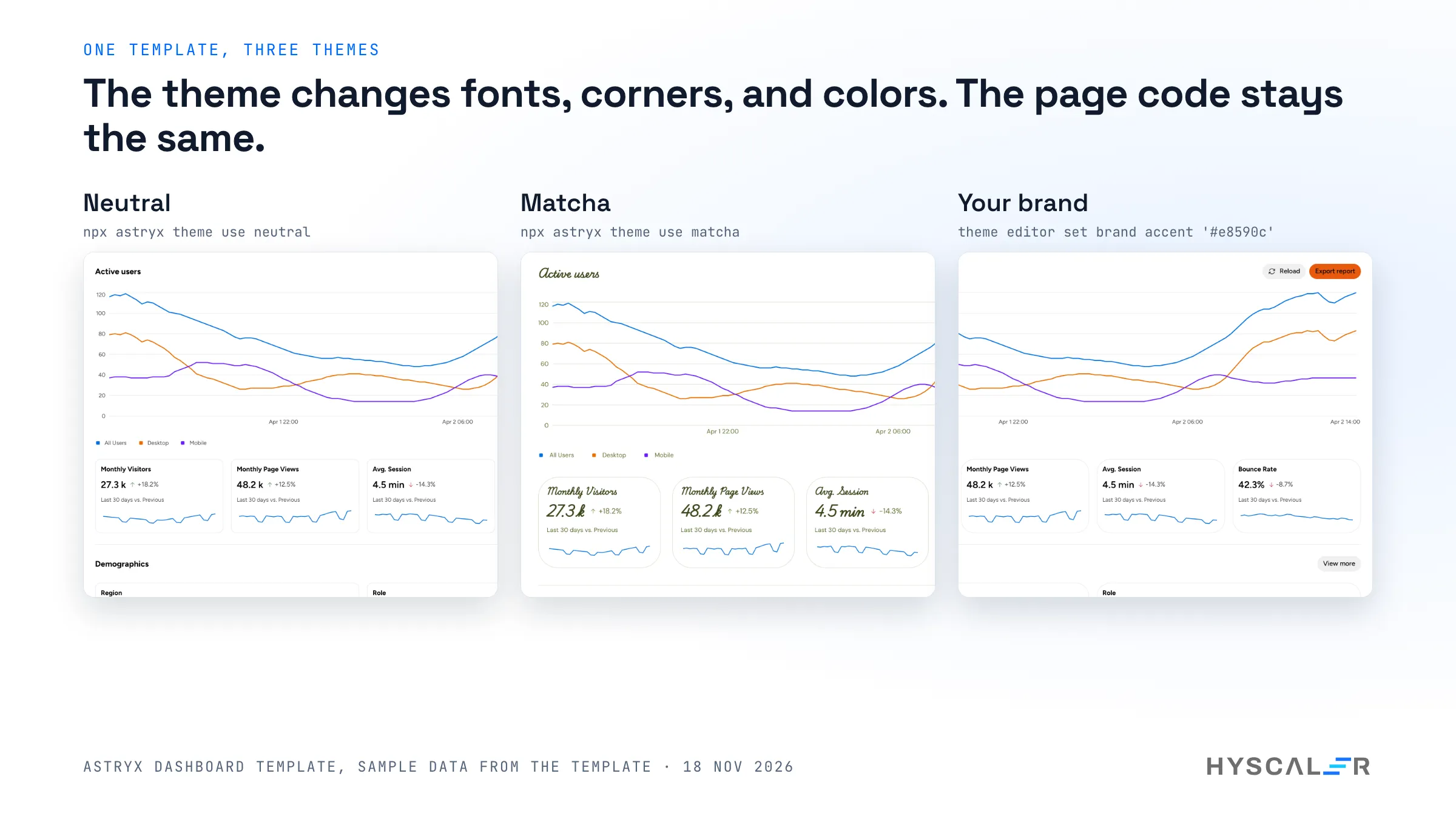
A dashboard is one page. The point of 58 templates is that the next page costs one more command. We added three:
npx astryx template ai-chat ./src/pages/ai-chat
npx astryx template payment-form ./src/pages/checkout
npx astryx template login-split ./src/pages/login
With the dev server still running, /ai-chat showed a chat transcript beside a document panel, /checkout a long payment form with an order summary that stays in view, and /login a sign-in form next to a media panel. None of them needed another package, and we wrote no layout code.
Three things we noticed:
- Demo images are swapped for placeholders. For the checkout and login templates, the tool printed “Replaced 3 Astryx demo media references” and explained that images now show a neutral placeholder. Supply your own media there.
- The first load of a new page may need a refresh. Vite bundles the components a page uses the first time it is opened. In our runs, a new page sometimes came up blank or logged a failed module fetch on its first load; it either recovered by itself or worked after one reload.
- Not every template works on the default setup. Of ten more templates we scaffolded,
kanban-boardandtable-inboxrendered a blank page with the same StyleX error as an ejected component, because their own source uses StyleX. They need the compiler setup described further down.
Switch themes with one command
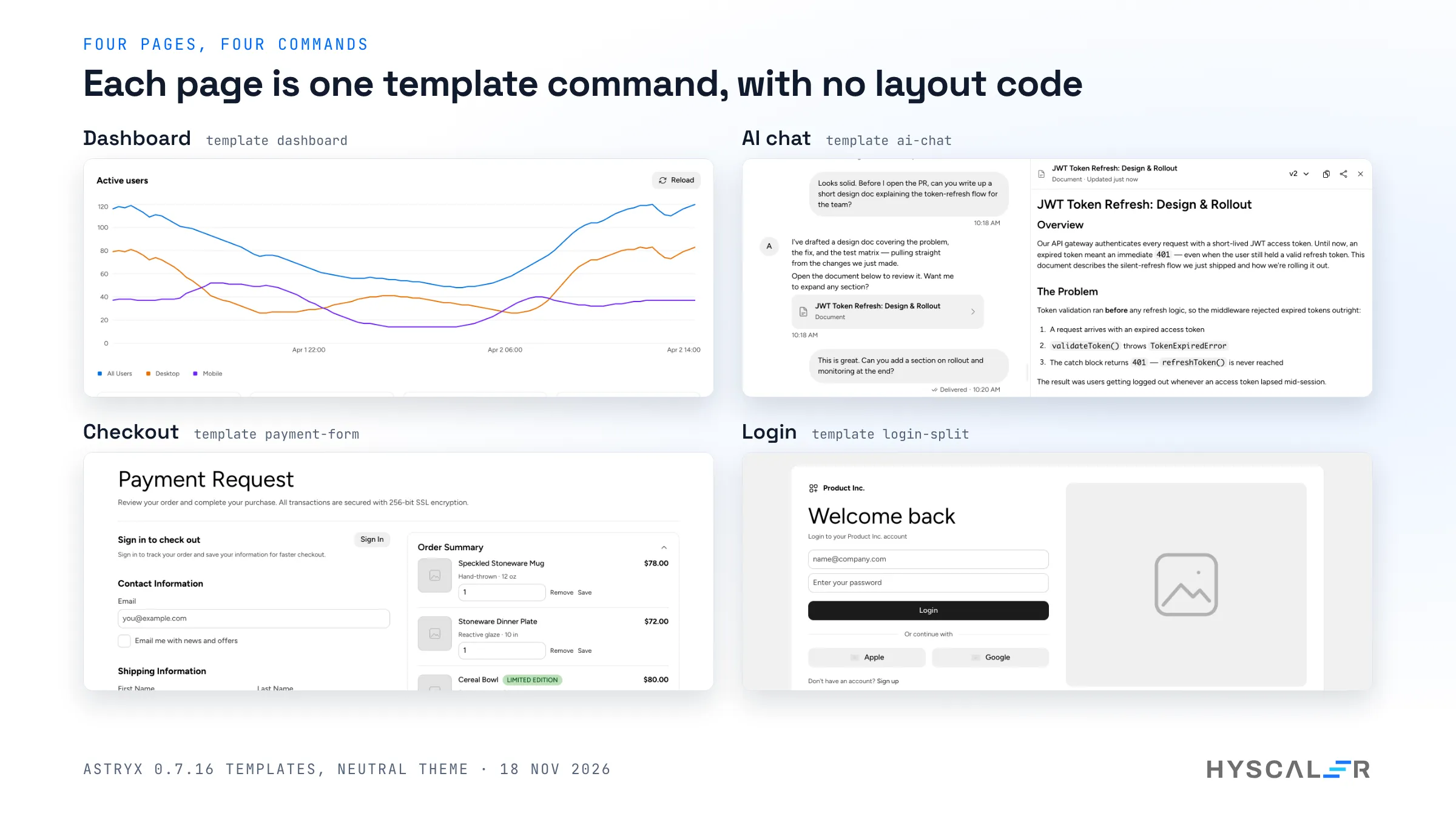
Install two more theme packages, add them, and make one the default:
npm install @astryxdesign/theme-matcha @astryxdesign/theme-y2k
npx astryx theme add matcha
npx astryx theme add y2k
npx astryx theme use matcha
theme add appends the theme to the generated module, and theme use changes one line in it:
default:    matcha
modulePath: src/astryx-themes.ts
action:     use
slug:       matcha
changed:    true
With the dev server running, the open page switched from Neutral to Matcha 0.9 seconds after we started the command. Headings changed to a script font, cards got rounder corners, and text turned olive. No component code changed.
npx astryx theme use y2k went further: square corners, hard borders, lime buttons, and the Poppins font, on all four pages at once.
npx astryx theme list shows all seven themes and which ones your app has added. If you try to add a theme whose package is missing, the tool tells you the exact npm install to run it first.
Dark mode
Dark mode needed no code. The <Theme> component takes a mode prop, which is 'system' by default, so the app follows the operating system. When we switched the browser’s color scheme to dark, the dashboard followed. Pass mode="light" or mode="dark" to force one.
Read component docs from the terminal
npx astryx component Button --dense
npx astryx build "analytics dashboard"
The first prints a component’s import line, anatomy, props, and best practices. The second takes an idea in plain words and names the template to start from; for “analytics dashboard,” it suggested the dashboard template and two alternatives. npx astryx template --list printed 58-page templates and 726 smaller block templates on 0.7.16.
Find a component when you do not know its name
search looks across components, hooks, docs, templates, and themes at once:
npx astryx search "date picker"It has no component called DatePicker. The search returned 70 results, and the top three were the ones we wanted: Calendar, DateInput, and DateTimeInput, each with a one-line description and the command that prints its docs. This is the command an agent should run before it invents a component name.
Add a component by hand
We added a primary button next to the template’s Reload button. npx astryx component Button lists the props: label is required, variant is one of primary, secondary, ghost, or destructive, and size is sm, md, or lg.
<HStack gap={2} vAlign="center">
  <Button
    label="Reload"
    variant="secondary"
    size="md"
    icon={<Icon icon={ArrowPathIcon} size="sm" />}
  />
  <Button label="Export report" variant="primary" size="md" />
</HStack>
Two things stand out if you come from other libraries. The button’s text is a label prop, not a child, so every button has an accessible name by construction. And spacing is a prop on the layout component (gap={2}), not a class or a margin, which is how the agent guide can tell an agent to write no raw <div>.
How to make your own brand theme in Astryx
The seven ready-made themes are a start, but a product needs its own colors. In 0.7.16, the way to do that is the theme editor, which is marked experimental and may change in a patch release. It worked in our test after one fix.
npx astryx experimental theme editor new brand --like neutralThe first run failed:
Error: The theme did not build, so the files were put back as they were: Cannot find module 'tslib'The CLI uses a package that needs tslib, and a new Vite app does not have it. npm install -D tslib fixed it, and the same command then printed made theme "brand" on top of neutral. It wrote the theme’s settings and source into themes/brand/, a built copy into src/themes/brand/, and a self-contained preview.html you can open without touching the app.
Change one thing at a time, with plain values:
npx astryx experimental theme editor set brand accent '#e8590c'
npx astryx experimental theme editor set brand corners pill
Each set rebuilt the theme in about three seconds and explained what it did. For our orange, it reported that text on the accent color would be near-black, not white, because white reaches a contrast ratio of only 3.58:1 and near-black reaches 5.87:1. That is the kind of check a hand-written theme file skips.
If you do not know what to set, ask in words. npx astryx experimental theme editor how "orange primary buttons" answered with the exact command, including the part and the variant it applies to.
Then add the theme like any other:
npx astryx theme add brand
npx astryx theme use brand
theme add listed it with source: local, next to the two package themes. The dashboard came up with pill-shaped buttons and cards, and our new Export report button in the brand orange with dark text. The login page shows it best: the Login button turned orange, and the fields became pill shaped.
Using Astryx with Claude Code and other agents
Run this once in the project:
npx astryx initIn our project, which had no agent files, it printed AI agent docs installed -> AGENTS.md, GEMINI.md. The block it wrote into AGENTS.md was 35 lines (2,633 bytes), and it has three parts:
- Setup: the two stylesheet imports, with a note that components render unstyled without them.
- Workflow: run
astryx build "<idea>"to find the template to start from, scaffold it withastryx template, keep its frame and spacing, and readastryx component <Name>before using a component. - Rules: “No
<div>“, “Style with component props first”, “No raw hex/px”, and a self-check that tells the agent to re-read its file and replace anyclassName=, inline style, or hardcoded color.
It is short on purpose. The guide does not try to teach the agent every component; it teaches it where to look, and the CLI does the rest.
Two things to know:
- Claude Code needs a flag in a new project. Plain
initwrites to the Claude Code file only if the project already has one.npx astryx init --agent claudecreated.claude/CLAUDE.mdfor us. astryx mcpis not in 0.7.16. The README on the main branch lists anmcpcommand that serves every command as an MCP tool. In 0.7.16,npx astryx mcpansweredunknown command 'mcp'. The canary build (0.7.17-canary) has it, so expect it in the next release.
Security and privacy: what leaves your machine
- Two install scripts, both harmless.
@astryxdesign/coreand@astryxdesign/clieach run apostinstallscript. We read both at this commit: each prints a one-line reminder to runastryx initand does nothing else. npm 11.19 flagged them with an “install scripts not yet covered by allowScripts” warning. - No telemetry found. We searched the CLI source for analytics and telemetry code and found none. The
blogcommand reads Astryx’s published feed, and a copy installed for the whole computer checks for a newer release once a day;NO_UPDATE_NOTIFIERorCIturns that off. - Theme fonts load from Google Fonts. Each theme’s
fonts.cssimports its fonts fromfonts.googleapis.com. With Matcha, our page requested DM Sans and Playwrite US Trad from Google’s servers. If your privacy policy rules that out, host the fonts yourself. - Two commands write outside the project. Per the CLI’s help text,
init --userputs a skill file in your home folder for every agent on the computer, and a global install (npm i -g @astryxdesign/cli) keeps one there too. We ran neither; our install was per project.
How to eject a component without breaking the page
Astryx calls ejecting “swizzle”. It copies a component’s source into your project so you can change it. It is the answer to “what if I need something the props do not allow?”, and it has a cost you should know before you run it.
npx astryx swizzle ButtonThis copied 24 files into components/astryx/: the 1,181-line Button.tsx and the internal modules it needs. The tool also printed a warning that these files use StyleX and need a StyleX compiler. It means it. When we pointed our page at the copy and reloaded, the page was blank, and the console said:
Unexpected 'stylex.create' call at runtime. Styles must be compiled by '@stylexjs/babel-plugin'.This is what fixed it in our Vite app:
- Install the build tools with
npm install -D @astryxdesign/build @stylexjs/unplugin. - Add the plugin to
vite.config.ts, before the React plugin:
import react from '@vitejs/plugin-react'
import { defineConfig } from 'vite'
import { astryxStylex } from '@astryxdesign/build/vite'

export default defineConfig({
  plugins: [...astryxStylex(), react()],
})- Remove the
astryx.cssimport. The plugin compiles Astryx from source, and with the import still there, the dev server failed withENOENT: no such file or directoryforcore/src/astryx.css. - Give StyleX a stylesheet to write into. Our
src/index.cssbecame:
@import '@astryxdesign/core/reset.css';

:root {
  --stylex-injection: 0;
}- Add
"browserslist": ["last 1 Chrome version"]topackage.json, as Astryx’s own Vite example does. Its README explains that Astryx tokens use the CSSlight-dark()function, and older browser targets make the CSS tooling rewrite it in a way that breaks theming. Widen the list to the browsers you support that havelight-dark().
After that, the page rendered with our copy of the button, and the production build passed. The trade is in the numbers under gotcha 3 below: less CSS, a slower build, and 24 files that are now yours to keep in step with upstream.
Limits and gotchas
From our test, in the order we hit them:
- The README quick start loads no font. It imports three stylesheets (
reset.css,astryx.css, and the theme’stheme.css). None of them loads the theme’s font, so the page fell back to the system font and made no font request.npx astryx theme addalso imports the theme’sfonts.css. Use the CLI. - An ejected component needs a StyleX compiler.
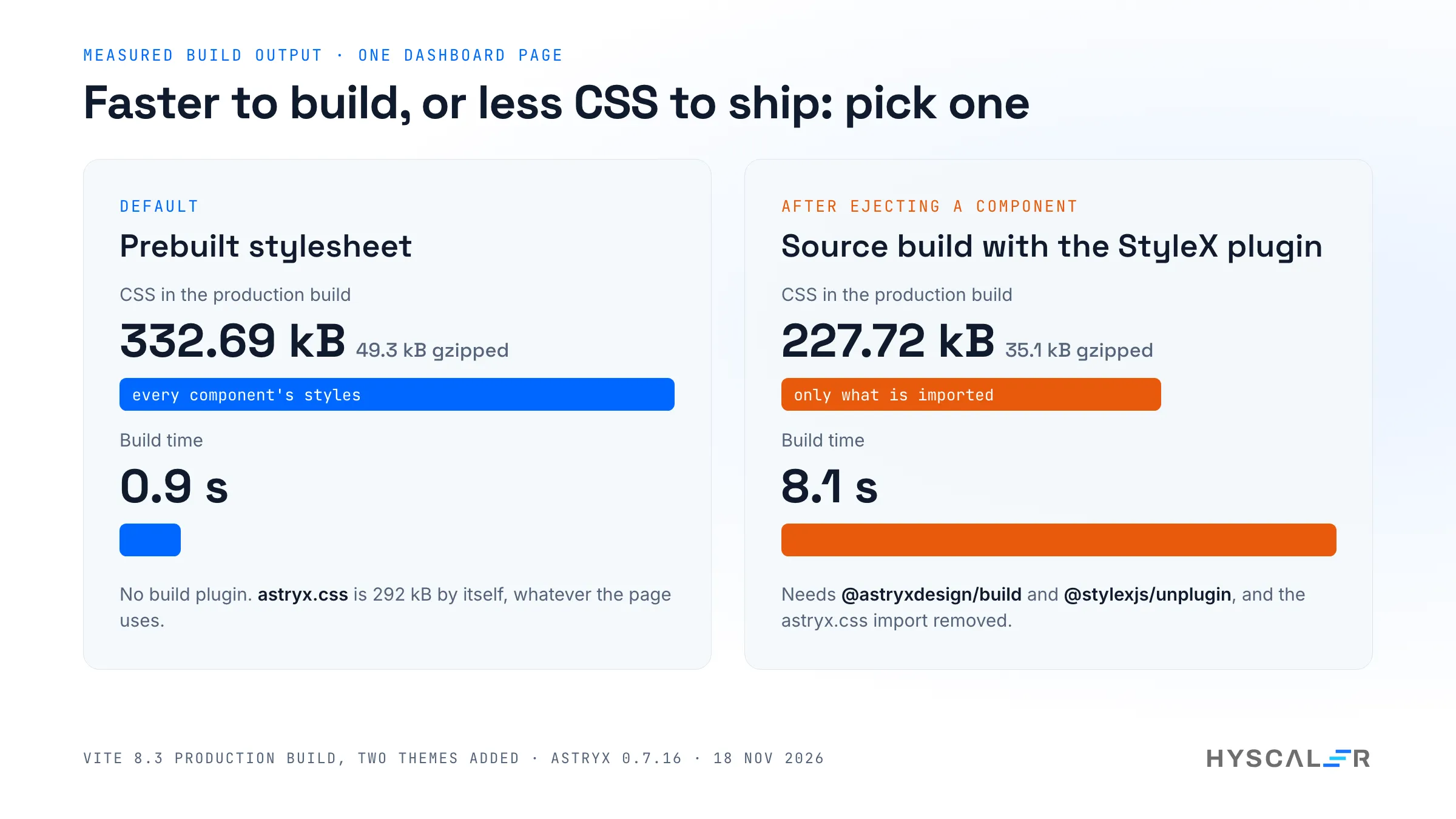
npx astryx swizzle Buttoncopied 24 files, and importing that copy blanked the page until we added a compiler and moved the app to a source build. The section above has the five steps. Two of the page templates we tried,kanban-boardandtable-inbox, need the same setup. - The prebuilt stylesheet carries every component. Our one-page app built to 332.69 kB of CSS (49.3 kB gzipped), because
astryx.cssis 292 kB by itself. The source build brought CSS down to 227.72 kB (35.1 kB gzipped), but the build took 8.1 seconds, against 0.9. With four themes and four pages, the prebuilt build printed 385.00 kB (53.9 kB gzipped). - The README is ahead of the release. The
mcpcommand is documented on the main branch and missing from 0.7.16 (see above). When a documented command fails, checknpx astryx --helpfor what your version has. - Themes are pinned to the core version. Each theme package declares the exact core version as a peer dependency (
0.7.16for ours). Upgrade core, the CLI, and every theme together, then runnpx astryx upgrade. - It is a beta that ships almost daily. Six releases in eight days, and 348 open issues on the day we tested. Pin exact versions for a team, and read the release notes before each bump.
- The theme editor needs
tslib.experimental theme editor newfailed withCannot find module 'tslib'in a new Vite app until we rannpm install -D tslib. - The source check flags Astryx’s own files.
npx astryx doctor --built .listed six styling findings in our project. They included the stylesheet imports in the theme module Astryx generated, and an inline style in it’s own dashboard template. Read that list as hints, not as failures.
Astryx vs shadcn/ui vs MUI
“Astryx vs shadcn” is one of the most common searches about it, so here is how the three differ. The Astryx column is from our test; the other two columns describe how those projects work in general.
| Astryx 0.7.16 | shadcn/ui | MUI (Material UI) | |
|---|---|---|---|
| How you get components | npm packages with prebuilt CSS and JS | A CLI copies component source into your repo | npm packages |
| Styling | StyleX, compiled ahead of time; override with className, Tailwind, or tokens | Tailwind CSS classes on headless primitives | Emotion CSS-in-JS by default, with the sx prop |
| Theming | Theme packages, switched with theme use; tokens are CSS custom properties | CSS variables you edit in your own stylesheet | createTheme and a ThemeProvider |
| Owning the code | Opt in per component with swizzle; needs a StyleX compiler | Always: the code is yours from the first command | Rare: you wrap or override |
| Page templates | 58 pages and 726 blocks from the CLI | Blocks you copy from the site | Separate template offerings |
| Guide for coding agents | Written by astryx init | Not part of this test | Not part of this test |
| Maturity | Public beta, 0.x, several releases a week | Established | Established for over a decade |
| Licence | MIT | MIT | MIT for the core library |
The short version: pick shadcn/ui if you want to own every line and already use Tailwind. Pick MUI if you want a stable, well-known library. It is worth a trial if you want a full system with themes and templates, and you build with coding agents. LogRocket’s Astryx vs shadcn/ui test from August 2026 compares the two with Claude Code on an earlier version.
Who should use Astryx, and who should wait
Based on this test, my read is:
- Try it now if you are starting an internal tool or a dashboard, you are on React 19, and coding agents write a good share of your UI. The templates and the agent guide pay off on day one, and a breaking change in a beta costs little in a new project.
- Trial it on a branch if you have a product on shadcn/ui or Radix, and you are tired of maintaining copied components. The CLI has a migration guide (
npx astryx docs migration); we did not test it. - Wait if you need a stable API, support for React 18, or a small CSS budget on a public site. A release every day or two is a real cost for a team that ships to customers, and 49 kB of gzipped CSS before your own styles is a lot for a landing page.
Frequently asked questions
What is Astryx?
Astryx is an open-source React design system from Meta, released as a public beta in June 2026 under the MIT licence. It provides accessible components, seven ready-made themes, page templates, and a command line tool that developers and AI coding agents both use. Version 0.7.16 lists 174 components and needs React 19 or later.
How do I install Astryx?
Install three packages with npm install @astryxdesign/core @astryxdesign/theme-neutral @stylexjs/stylex, add the CLI with npm install -D @astryxdesign/cli, then run npx astryx theme add neutral. Import reset.css and astryx.css, and wrap your app in the Theme provider. In our test, the installs took under a minute in a new Vite app.
How do I use Astryx in a React app?
Start every page from a template. Run npx astryx template --list to see the page templates, scaffold one with npx astryx template dashboard ./src, install the extra packages it names, and render the page in your app. Look up any component with npx astryx component Button before you change it.
Is Astryx better than shadcn/ui?
They solve different problems. shadcn/ui copies component source into your repo, so you own and maintain it. Astryx is a packaged system with themes, templates, and docs that an agent can read, and it lets you eject single components. In our test, ejecting a Button copied 24 files and required a StyleX compiler.
Does Astryx work with Tailwind CSS?
Yes, according to its README, which documents a Tailwind setup: Astryx ships prebuilt CSS, and a tailwind-theme.css bridge maps its tokens to Tailwind utilities such as bg-surface and text-primary. We did not test the Tailwind path in this run; our test used the default setup in a Vite app.
Does Astryx support dark mode?
Yes. The Theme component has a mode prop that defaults to 'system', so an Astryx app follows the operating system’s light or dark setting with no extra code. You can force one with mode="light" or mode="dark". In our test, the dashboard switched as soon as the system setting changed.
Does Astryx work with Claude Code?
Yes. npx astryx init --agent claude writes a short Astryx guide into .claude/CLAUDE.md, and plain npx astryx init writes it into AGENTS.md and GEMINI.md. The guide tells the agent to start from templates and to read component docs from the CLI. The MCP server documented in the README is not in version 0.7.16.
Is Astryx ready for production?
It depends on how much change you can absorb. Astryx is a public beta on 0.x versions and shipped six releases in eight days in November 2026. The components come from years of use inside Meta, but the public API still moves. Pin exact versions and plan time for upgrades.
Does Astryx need React 19?
Yes. @astryxdesign/core declares react and react-dom version 19.0.0 or later as peer dependencies, and each theme package requires React 19 as well. A new Vite app installed React 19.3 in our test, so new projects are fine. An app on React 18 has to upgrade React before it can use it.
What is StyleX, and do I have to learn it?
StyleX is Meta’s styling library, which compiles styles to static CSS at build time. It is written with it, but it ships prebuilt CSS, so you can use Astryx without writing or compiling StyleX. You only need a StyleX compiler if you eject a component with swizzle, or build Astryx from source.
How do I create a custom theme in Astryx?
Use the theme editor in the CLI. Run npx astryx experimental theme editor new brand --like neutral, change values with set brand accent '#e8590c' or set brand corners pill, then run npx astryx theme add brand and npx astryx theme use brand. In our test on 0.7.16, it needed tslib installed first.
Is Astryx free to use?
Yes. it is open source under the MIT licence, including the components, the seven themes, the templates, and the CLI. We found no paid tier or licence key anywhere in the install. The costs are the usual ones for a beta library: upgrade work, and your own review of the code your team ships.
Watch the setup video
The video records the same steps on a real terminal next to the running app: the install, four pages from templates, three themes, dark mode, a brand theme, and three of the gotchas. Link to follow once it is on the HyScaler YouTube channel.
Try it
The code is at github.com/meta/astryx and the docs are at astryx.atmeta.com. Every command above works in an empty folder, so the cheapest way to judge Astryx is to run them and look at the result.
If your team is choosing a design system for a product that coding agents will help build, HyScaler builds and reviews AI-powered web and mobile products for clients. More of our engineering notes are here. Disclosure: I work at HyScaler.
References
- Astryx 0.7.16 release notes
- StyleX documentation
- shadcn/ui documentation
- Material UI: getting started
- LogRocket: Astryx vs. shadcn/ui, tested with Claude Code (13 August 2026)
- OpenReplay: A first look at Astryx (29 September 2026), which dates the announcement to 18 June 2026
- Better Stack: Astryx, Meta’s open source agent-ready design system (27 July 2026), which dates the release to 28 June 2026