Table of Contents
Application interface design is the way an app’s screens, controls, and content work together. When it works, people finish tasks faster, trust the product sooner, and don’t waste time guessing what to tap next.
A good interface doesn’t show off. It gets out of the way and lets the task happen. That matters for users and for business, because confusing screens lead to abandoned signups, missed checkouts, and support tickets that never should’ve existed.
The apps people stick with usually get four things right: clarity, consistency, accessibility, and testing. Everything else sits on top of that.
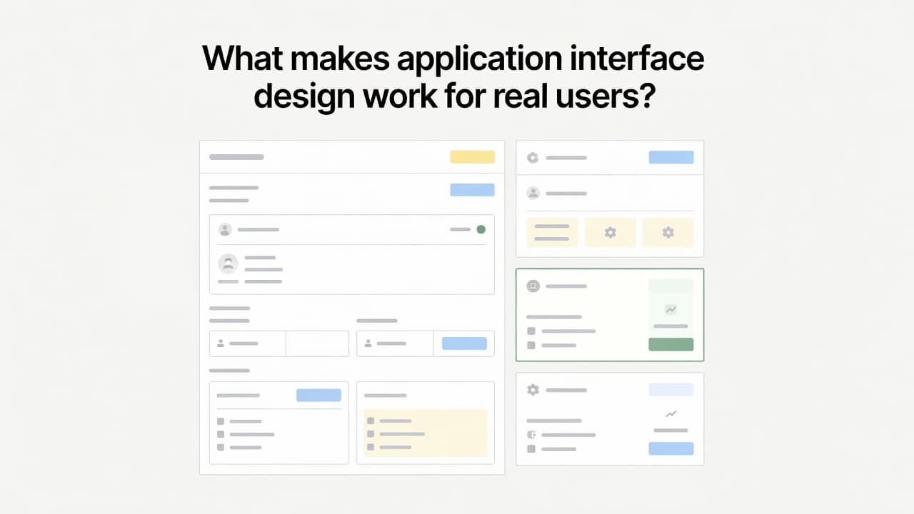
What makes application interface design work for real users?
Good interface design isn’t decoration. It’s traffic control. Every label, button, and empty space either lowers effort or adds to it. Looks matter, but only after the flow makes sense.
Start with the task, not the screen
Start with the job the person came to do. Sign in. Find a report. Finish checkout. Save a setting. Once the task is clear, the screen stops being a collage and starts being a tool.
That’s why the best interfaces feel obvious. They line up with real goals instead of showing every feature at once. If a person opens your app to do one thing, the design should meet them there.
Why clarity beats clever design
Cute labels and surprising menus wear out fast. A button should say what it does. A form should ask only for what it needs. The next step should be easy to spot.
Speed beats surprise when someone’s trying to get work done. If users have to pause and decode the interface, the design is already asking too much.
The key building blocks of a clean application interface
Once the goal is clear, the interface needs solid parts. This is where many apps slip. The pieces exist, but they don’t support each other. Polish comes from structure, not decoration.
Use layout and visual hierarchy to guide the eye
Spacing does more than make a screen look neat. It tells people what belongs together and what matters first. Size, color, and placement do the rest. The main action should stand out without yelling.
When hierarchy is weak, every element feels equally loud. That slows people down because they have to decide where to look before they can decide what to do. One primary action per screen is often enough.
Make navigation feel obvious and predictable
Menus, tabs, sidebars, and breadcrumbs should answer two questions fast: where am I, and how do I get back? Familiar patterns help because people already know how to use them.
Hidden paths and shifting menus break confidence. A short community discussion on good UX design lands on the same advice, keep the layout neat and make the point of focus obvious. Too many choices don’t feel flexible. They feel noisy.
Design buttons, forms, and feedback that guide action
Buttons need plain labels like “Save changes” or “Continue to payment.” Forms need readable fields, useful examples, and error messages that explain how to fix the problem. “Invalid input” is weak. “Enter a valid email address” is useful.
Feedback matters just as much. A loading state says the app heard the tap. A success message removes doubt. Platform guidance like Apple’s UI design tips push the same basics, show primary content clearly and don’t make people hunt across the screen.
Read more
Explore 10 Unique Website For Design Inspirations For Developers
How to design an application interface people can actually use
A clean screen can still be hard to use. The difference usually comes down to consistency, access, and proof. Mobile behavior matters too, because small frustrations get bigger on a small screen.
Keep the experience consistent across every screen
When buttons change shape, labels shift, or navigation jumps around, people have to re-learn the app. That’s wasted effort. Repeated patterns help first-time users settle in and help regular users move faster.
Keep button styles matched. Put navigation in the same place. Use the same words for the same action. Even error messages should follow the same tone and structure. Small repeats build trust because the app behaves the way people expect.
Build for accessibility from the start
Readable text, strong contrast, keyboard use, and touch targets that aren’t tiny should be part of the first draft. Color alone can’t carry meaning, and screen readers need labels that make sense. Focus states should be easy to see, not hidden.
Accessible design helps more than one group. It helps someone on a cracked phone screen, someone in bright sunlight, and someone using one hand while walking to a meeting. Better access usually means less friction for everyone.
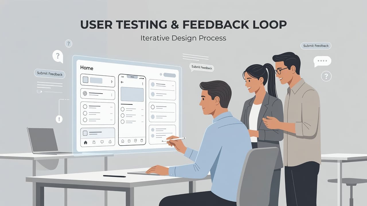
Test with real people before you launch
You don’t need a lab or a giant budget. Give someone a task, stay quiet, and watch. Can they sign up, change a setting, or finish a purchase without help? Ask them to think out loud while they move.
Testing reveals weak labels, broken flows, and actions people can’t find. If you want a quick visual example of those basics in motion, this UI/UX best practices walkthrough is a useful companion. Catching problems early is cheaper than fixing confusion after launch.
Conclusion
Strong application interface design shortens the path between intent and action. People know what to do, where to look, and what happened after each tap. An app shouldn’t feel like a riddle.
That’s the real mark of good design. Clear goals, simple layouts, steady patterns, accessible choices, and early testing beat flashy screens every time. If your app feels busy or confusing, review it like a first-time user and start removing friction.