

Table of Contents
Read your homepage headline out loud, then ask if a competitor could swap it onto their own site without anyone noticing.
That test breaks a lot of businesses. Their headlines lean on the same handful of words, like innovative, seamless, solutions, or cutting-edge. None of these words tells a visitor what the business actually does or why it matters to them.
Messaging problems rarely start with bad products. They usually include headlines, subheadlines, and CTAs that blend into the rest of the internet. A visitor who can’t figure out what you sell within a few seconds closes the tab, and you never find out why you lost them.
This post breaks down the messaging elements that fix this problem. Each one gives visitors a reason to stay, a clear picture of what you offer, and a reason to act on it.
Lead with a Value Proposition That Combines Credibility and Customer Value
Visitors decide whether your business fits their needs before they read a single line of body copy. Your value proposition carries that decision. It sits above the fold, and it either answers “Why should I trust you?” and “What do I get?” in one breath, or it leaves visitors guessing and clicking away.
Companies that sharpen this message see the payoff directly in their numbers. Clear value propositions push conversion rates up because they remove the guesswork that makes visitors hesitate before taking action.
Building one starts with combining two elements:
- Proof that you know what you’re doing, and a specific outcome the visitor gets from working with you.
- Skip vague claims like “industry-leading” or “best-in-class.”
- Name the result you deliver and back it with a credibility marker, whether that’s founder experience, years in business, or a track record with real numbers attached.
- Keep the language benefit-driven so visitors picture their own outcome, not just your process.
Here’s how it’s done by a proven brand:
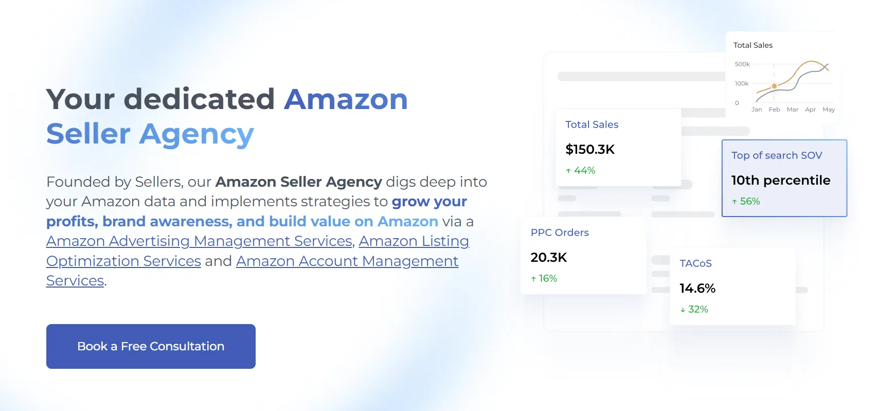
SellerMetrics, an Amazon PPC agency specializing in advertising, listing optimization, SEO, and account growth, builds this combination into a single headline.
Their homepage states “Your dedicated Amazon Seller Agency,” paired with microcopy explaining that the agency was founded by sellers and digs deep into a client’s Amazon data to grow their profits, brand awareness, and value on the platform.
The founders’ details signal credibility instantly. Sellers reading it know they’re working with people who’ve sat in their exact seat, and the microcopy spells out tangible gains, like profit growth, brand visibility, and increased value on Amazon.
Together, these lines tell visitors exactly who’s behind the agency and exactly what they stand to gain, all within a few seconds of landing on the page.
Messaging That Makes Complex Services Feel Easy to Understand
Technical products create a specific messaging problem. The more advanced your service gets, the harder it becomes to explain in plain terms, and visitors won’t stick around to decode jargon.
The best messaging strategies take complicated functionality and translate it into language a first-time visitor understands in seconds.
To implement this approach:
- Start with the outcome, not the mechanism. Visitors want to know what changes for them, not how your algorithm works under the hood.
- Write a headline that states the result plainly, then use the space below it to break the service into pieces.
- Explain each feature in one short sentence, paired with the specific problem it solves.
- If your service replaces or improves on something visitors already know, show that comparison directly.
- Side-by-side breakdowns let people map new technology onto something familiar, which cuts down on the mental effort needed to evaluate your business.
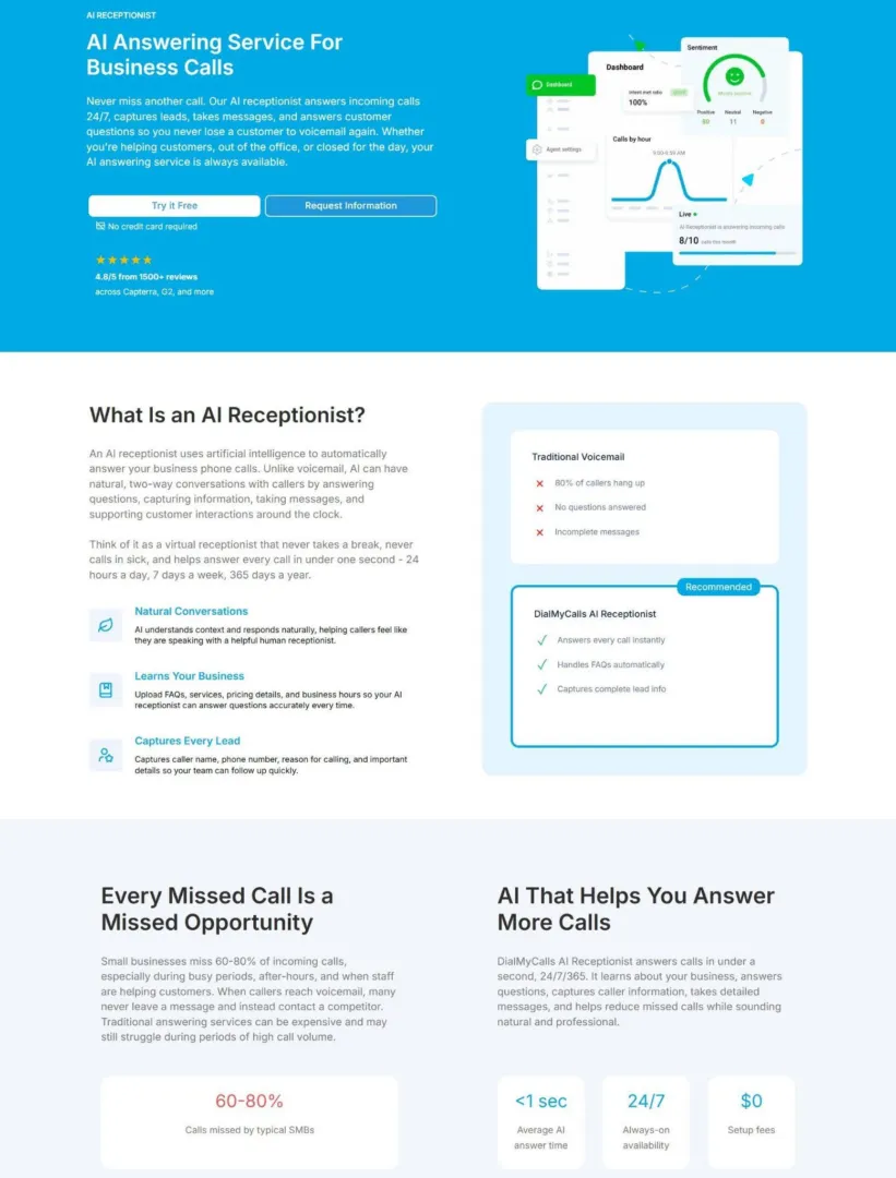
DialMyCalls, a mass text messaging platform for business communication, applies this approach on its AI receptionist landing page. The product answers calls instantly and around the clock, learning a business’s FAQs, pricing, and hours so it can respond to callers accurately.
Rather than opening with technical detail, DialMyCalls leads with a short, clear value proposition, then layers in plain-language explanations of what the AI actually does (capturing caller names, phone numbers, reasons for calling, and other details the business needs for follow-up).
Additionally, feature highlights break the tool into digestible pieces, and side-by-side comparisons against voicemail and traditional answering services give visitors a clear reference point.
This shows customers the practical difference between the old way of missing calls and the new way of catching each one, in terms that anyone running a business can grasp instantly.
Reinforce Your Core Message Throughout the Entire Page
One clear value proposition at the top of a page doesn’t guarantee that visitors will remember it by the time they scroll to the bottom. Attention drops as people move down a page, and new sections compete for focus.
Repeating your core message at key points keeps that focus anchored, so visitors reach your CTA already convinced instead of needing to be convinced again from scratch.
To make your messaging memorable:
- Build repetition into your page structure from the start.
- Write section headings that echo your main value proposition using different words each time, so the message stays consistent without sounding copy-pasted.
- Back each heading with supporting copy that ties back to the same core benefit.
- Use visuals that reinforce the message rather than distract from it.
- Write your CTAs so they restate the value proposition instead of relying on generic phrases.
- By the time a visitor reaches the bottom of the page, they should be able to state your value proposition in their own words.
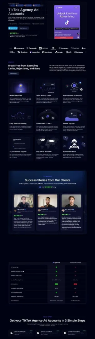
Uproas, a company that provides agency-level advertising accounts for businesses running campaigns on Meta, Google, and TikTok, applies this consistently on its TikTok Agency Ad Accounts landing page.
The page’s core message, unrestricted scaling with fewer bans and account limits, appears in the headline, then resurfaces in section after section. Supporting copy repeats the same theme through mentions of account stability and direct platform relationships.
Visuals reinforce the same idea. Benefit statements circle back to the same promise using new angles like lower CPMs and instant account replacements. The CTA closes the loop by pointing visitors back to that same core benefit.
Customers scrolling through the page encounter the same central idea from multiple directions, which builds a stronger, more consistent impression than a single mention ever could.
Use Social Proof to Validate Your Messaging
Your messaging tells visitors what you promise. Social proof tells them other people already believe it.
Without that second layer, even the clearest value proposition asks visitors to take your word for it, and most won’t. Adding proof elements changes visitor behavior at every stage of the page, not just at checkout.
Displaying social proof messages can increase the rate of micro-conversions by over 100%, which shows how much weight small actions like scrolling further or clicking a link carry when other people’s experiences back up your claims.
To nail this method:
- Place proof elements near the specific claims they support, not just in one testimonials section buried mid-page.
- If you promise fast results, put a client quote about speed right next to that promise.
- If you claim broad trust, show the number of customers or years in business close to your headline.
- Mix formats too. Written testimonials, star ratings, client logos, and award badges each carry different weight with different visitors, so use more than one type.
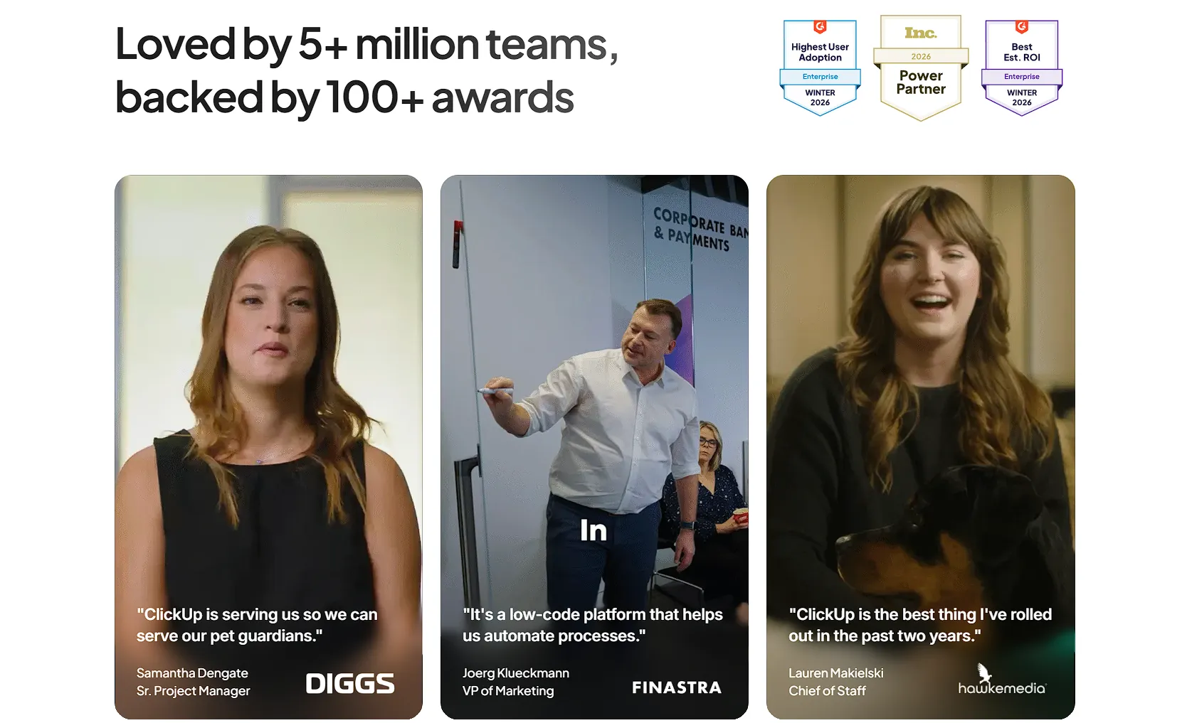
A brand that puts this into practice directly on its homepage is ClickUp, a work productivity platform that combines project management, docs, and team collaboration into one product built to replace several separate apps.
A section titled “Loved by 5+ million teams, backed by 100+ awards” sits prominently on the page, pairing a large user count with recognition from independent award bodies.
Below it, testimonials from well-known companies add specific, credible voices to the claim, while star ratings pulled from third-party review platforms give visitors an outside source to check against. Each element reinforces a different angle of trust: scale, recognition, and firsthand experience.
Together, they give visitors several independent reasons to believe ClickUp delivers what its messaging promises.
Show What Makes Your Business Different From Competitors
Visitors comparing options rarely stop at one site. They open a few tabs, weigh features side by side, and pick the one that makes the decision easiest.
If your website doesn’t show where you stand against alternatives, visitors piece that comparison together themselves, often using incomplete information or a competitor’s framing instead of yours.
To implement differentiation effectively:
- Build a comparison table that puts your product next to the options visitors already know.
- List the features that matter most to your buyer, then mark clearly which product includes each one.
- Keep the categories specific. Include exact capabilities, not vague descriptors like “great support” or “flexible pricing.”
- Visitors trust tables they can verify, so stick to claims you can back up, and update the table whenever your product or a competitor’s changes.
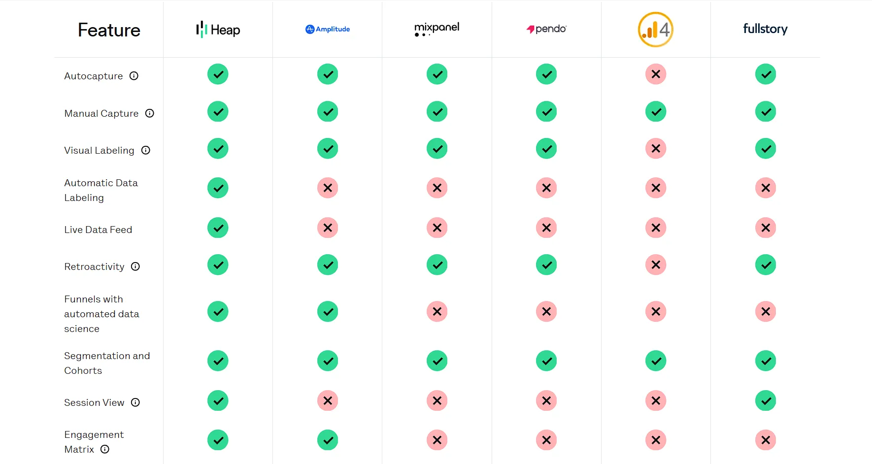
Heap, a digital insights platform that automatically captures every user interaction across a website or app, builds this into its site through a clean, well-organized comparison table.
The table lines up Heap’s capabilities against major competitors in the analytics space, breaking down specific features like automatic event capture, retroactive data analysis, and session replay. Each row states plainly whether a given tool includes that feature, letting visitors scan the table and see exactly where gaps exist among the alternatives.
This format works because it hands visitors the information they’d otherwise gather through multiple searches and competitor reviews. A person evaluating analytics platforms can see, at a glance, that Heap’s autocapture removes a setup step that some competitors require through manual tagging.
That kind of direct, checkable comparison builds confidence faster than a page full of unranked feature lists ever could.
Final Thoughts
High-performing websites rely on messaging that helps visitors understand, trust, and remember a brand. A clear value proposition, simple explanations, consistent messaging, social proof, and strong differentiation give customers the information they need to make confident decisions.
Review your website pages from the perspective of your audience. Check whether your message answers their main questions, highlights your strongest advantages, and supports the actions you want them to take. Small improvements to your wording and structure can create a clearer experience for visitors and stronger results for your business.
Effective website messaging requires ongoing refinement. As your customers, services, and market change, your messaging should evolve with them. A website that communicates with clarity gives every visitor a better reason to stay, explore, and engage.